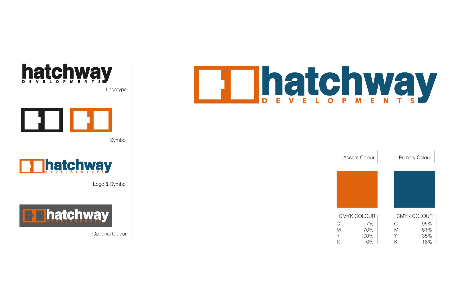

Hatchway Developments Branding
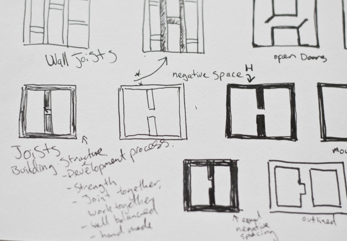
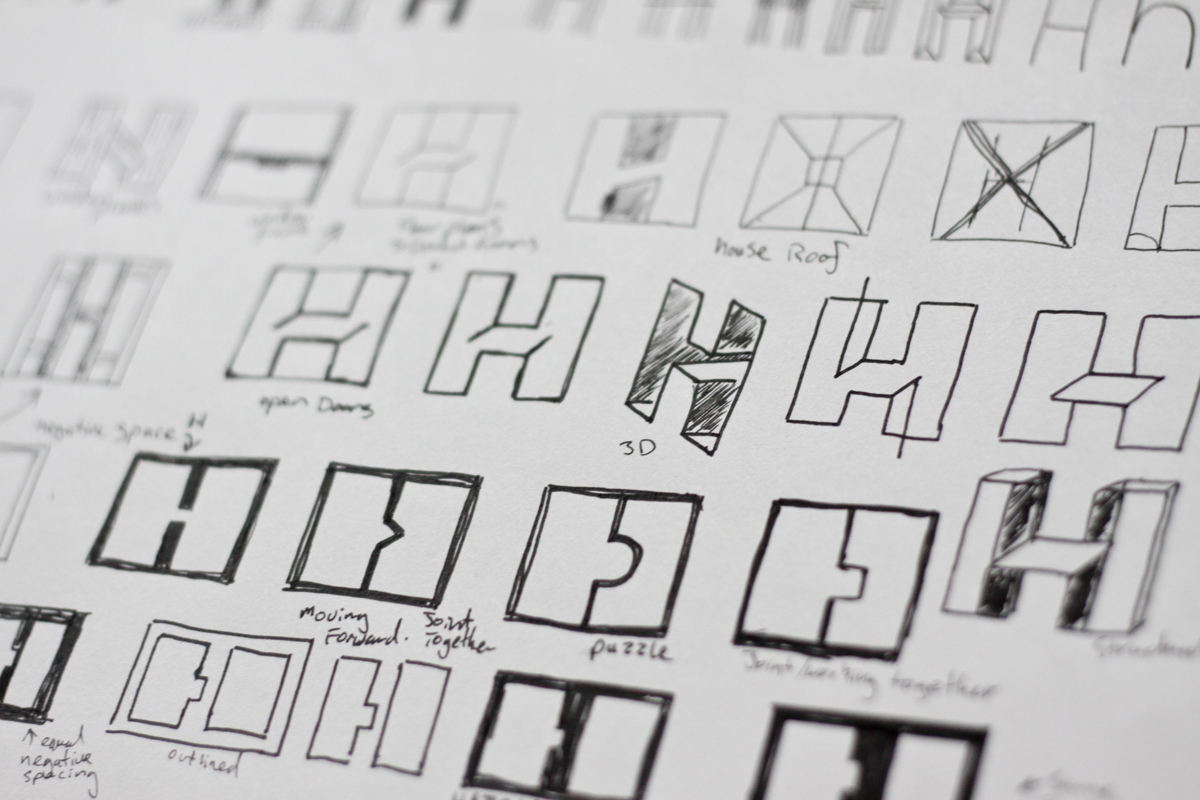
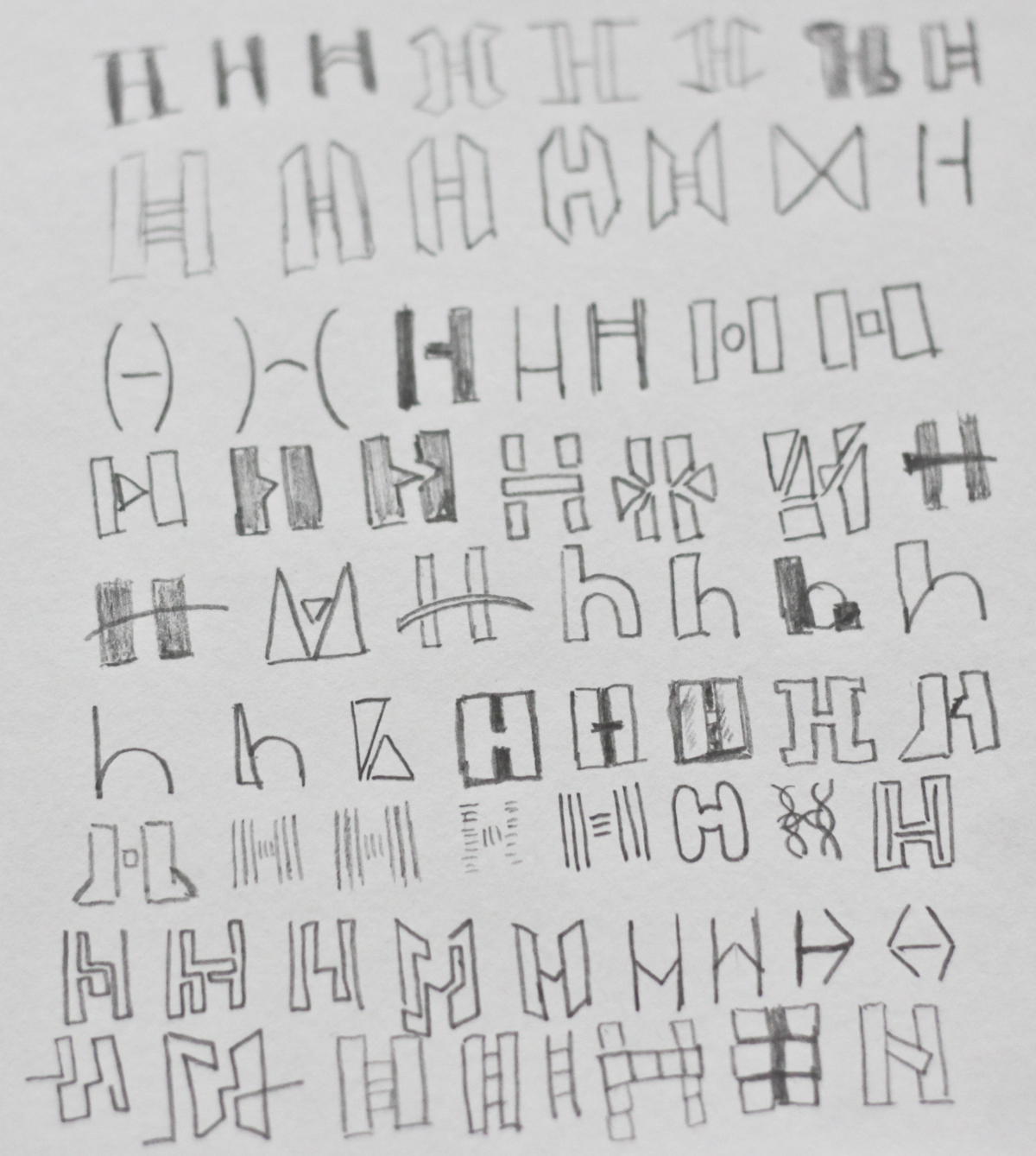
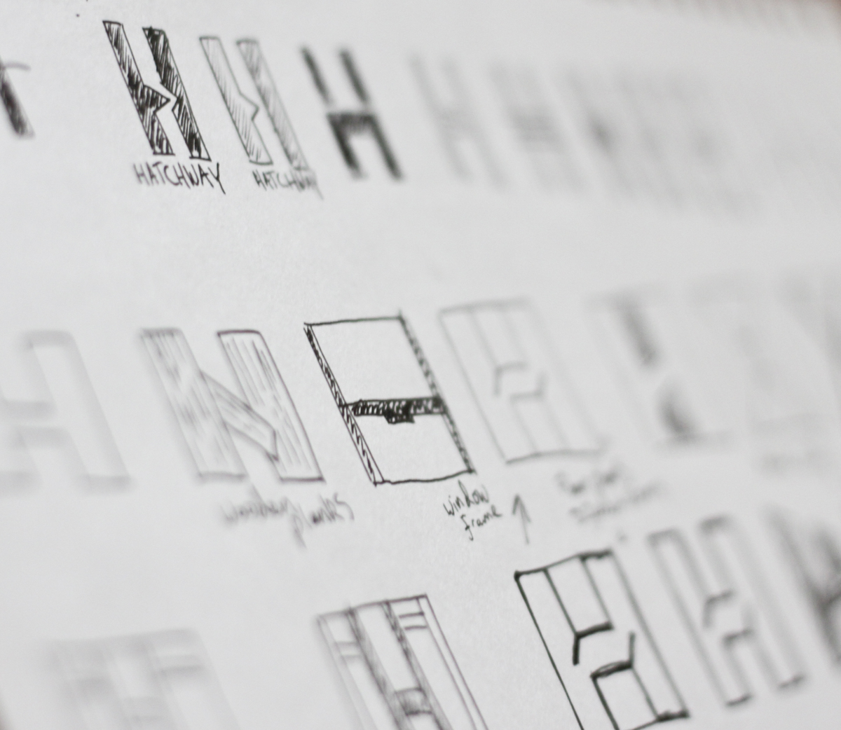
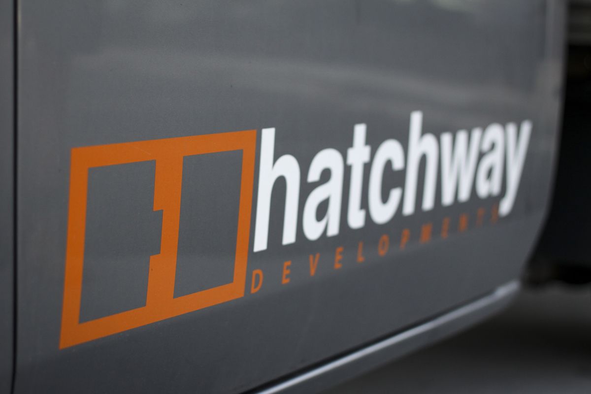
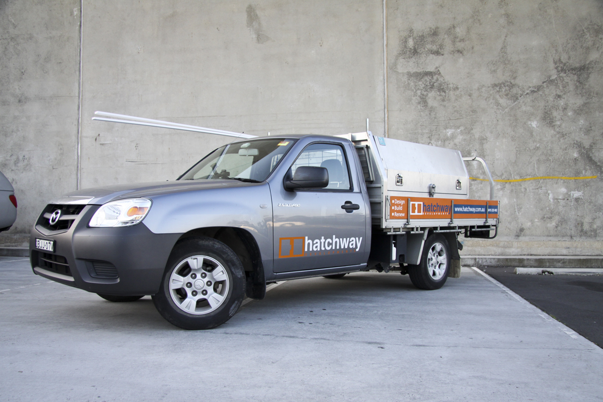
Hatchway Developments was a project I completed early this year. The client required an identity to help advertise his business. The idea of the logo came from the shape and structure from joists in a wall and represents strength, development, joining together, structure. When you look at the negative space a “H” for hatchway is seen. The identity was then used to produce business cards, stationary, advertisement, a website, car vinyls, T-shirts etc.